
Home
Next

Design Lead
UX + Identity
2024
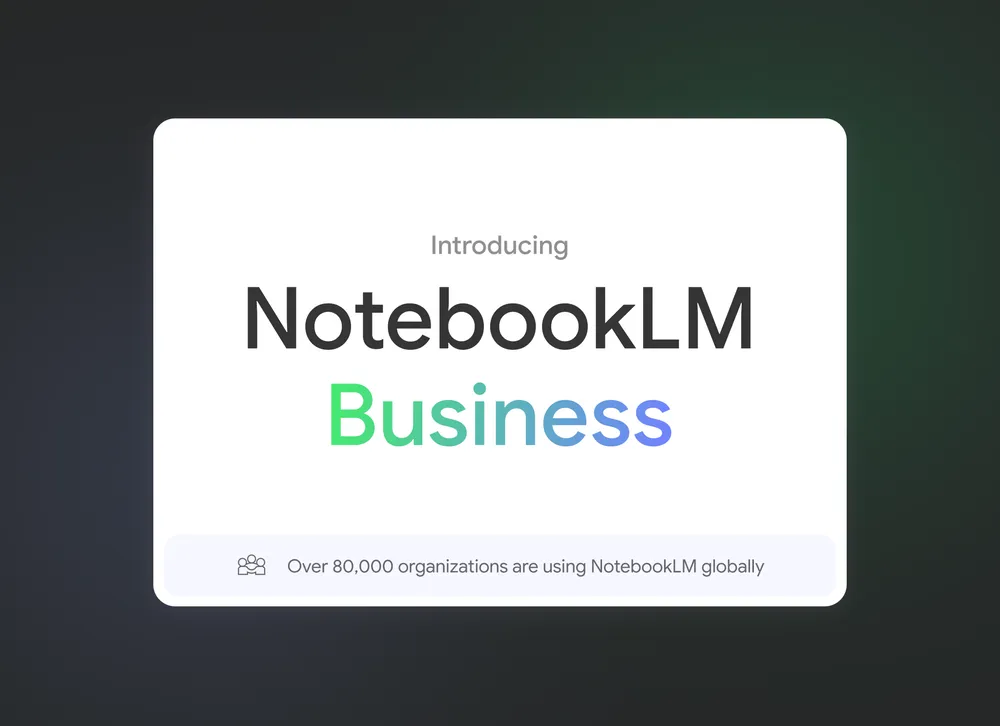
NotebookLM
I led design for NotebookLM, shaping the product’s core user experience, brand identity, and visual system from experiment to launch.
This remains one of my proudest projects, and I’m incredibly grateful for the opportunity to design something entirely new from the ground up. It was a chance to explore fresh paradigms, invent new patterns, and bring a product to life that hadn’t existed before. None of it would’ve been possible without the tight-knit, cross-functional team I was fortunate to collaborate with.
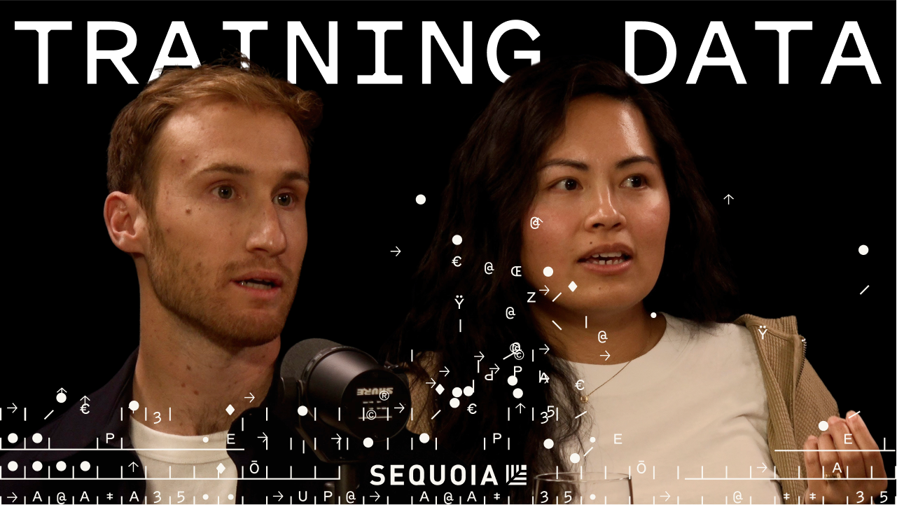
Podcast • Sequoia
Raiza and I discuss the journey building NotebookLM.
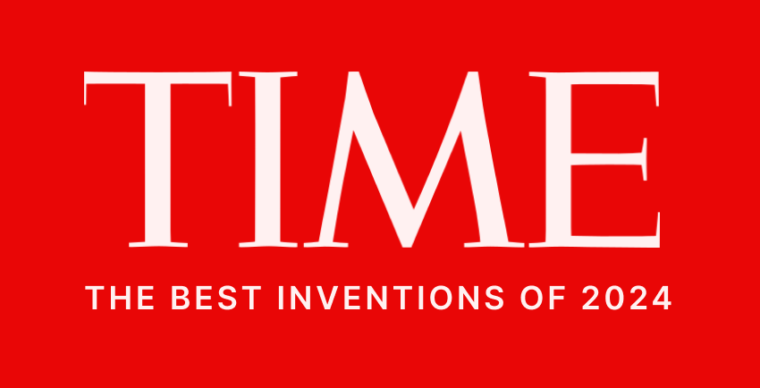
NotebookLM • Winner!
Recognized as one of TIME’s Best Inventions of 2024.

|
Architecture
|
3 Panel
|
Visual Assets
|
Architecture
UI Evolution

Early Prototype
This is what the UI looked like before I first joined the early project.

Notes driven UI
Exploratory chat UI introduced as an overlay on the note canvas.

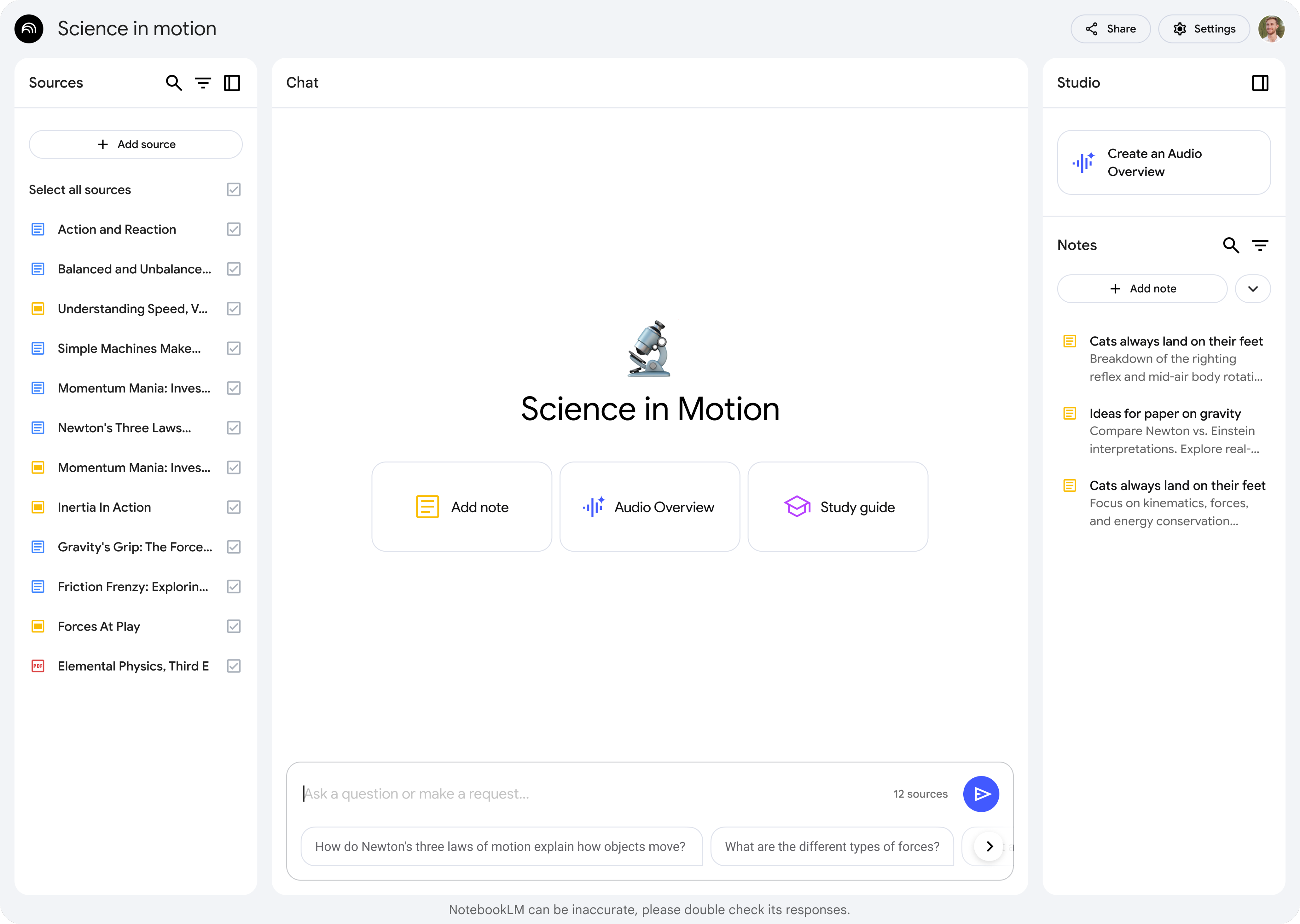
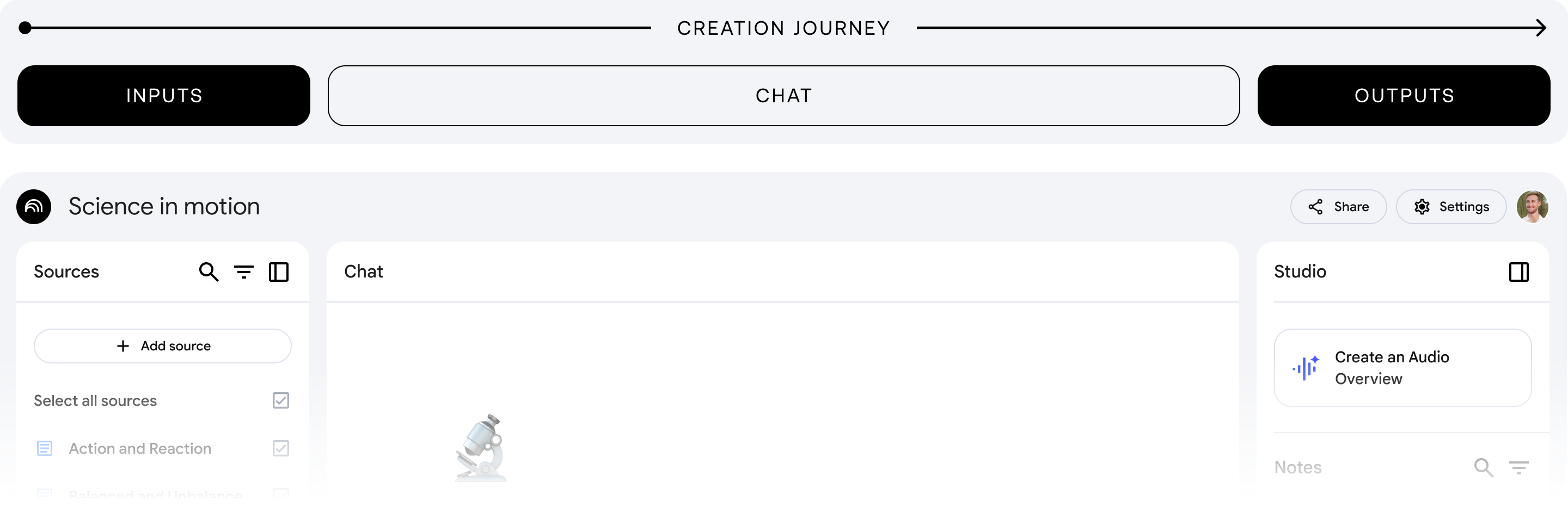
3-Panel Structure
Synthesizes learnings into a scalable and adaptive layout.
Problem + Requirements
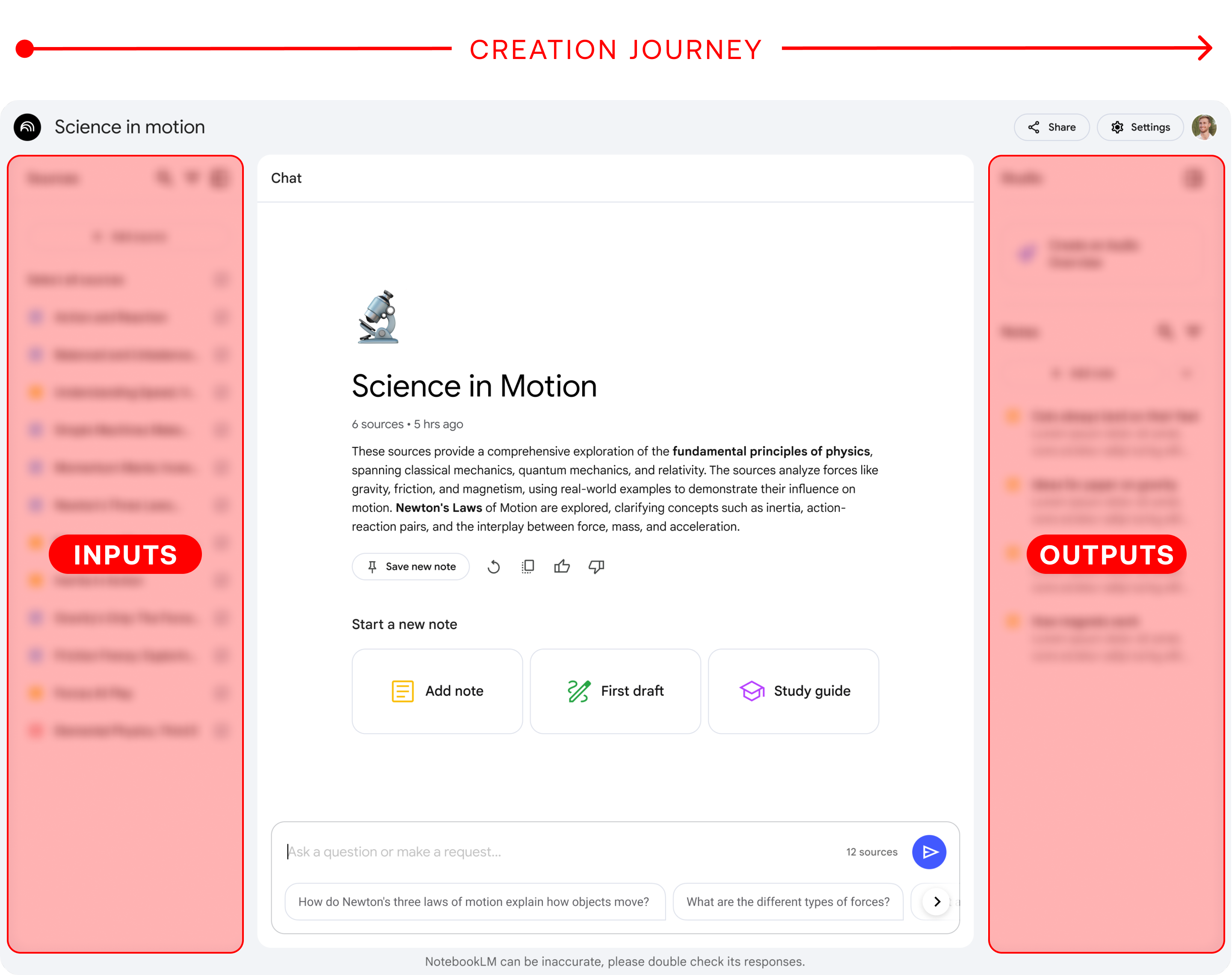
One of the core problems we set out to solve with NotebookLM was “tab overwhelm” the scattered, fractured experience of jumping between tools while trying to synthesize ideas. We wanted to create a space where every part of the creation journey could happen in one place.
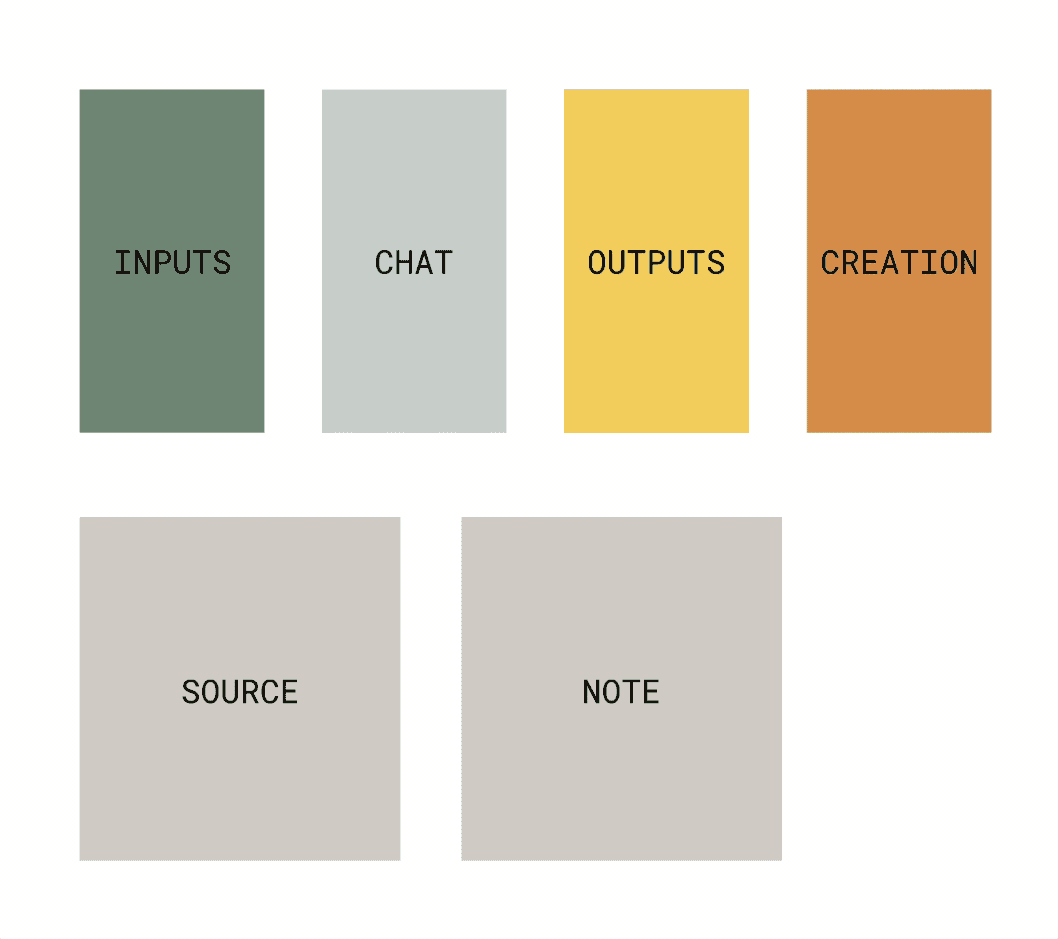
→ Inputs
- Source list, Open Source (wide)
Outputs →
- Notes list, Open Note (wide)
Chat
• Citations
Creation
• Multiple entry points
This visual shows how the core building blocks came together.

Early Sketches
The structure you see now may seem obvious but it took After what felt like 1000 iterations to get there. Trying to put these blocks together in a way that allowed for a clear mental model and digstible UI. These early sketches are from a plane. I ran out of paper and ultimately found the final solution when drawing on a napkin.
Mental Model
The mental model of NotebookLM was built around the creation journey: starting with inputs, moving through conversation, and ending with outputs. Users bring in their sources (documents, notes, references), then interact with them through chat by asking questions, clarifying, and synthesizing before transforming those insights into structured outputs like notes, study guides, and Audio Overviews.
By grounding the design in this linear but flexible flow (Inputs → Chat → Outputs) we gave users a clear sense of place within the product while keeping the complexity of new AI interactions digestible and intuitive.
Solution • 3 Panel Structure
It’s rare to find a product that brings reading, writing, and creation together in a truly integrated way largely because juggling all three can be overwhelming. But with AI reducing friction, the opportunity emerged to design a space where every part of the creative process could coexist.
To make that possible, I designed a responsive panel system that adapts to the user’s needs, scaling fluidly while preserving quick access to key elements like sources and notes, even at the smallest sizes.

- Standard
The default layout, offering a balanced view of sources, chat, and notes.

- Reading + Chat
Optimized for referencing sources and generating responses with citations.
- Chat + Writing
A popular request, designed for users focused on drafting and iteration.
- Reading + Writing
Ideal for composing while keeping source material in view.
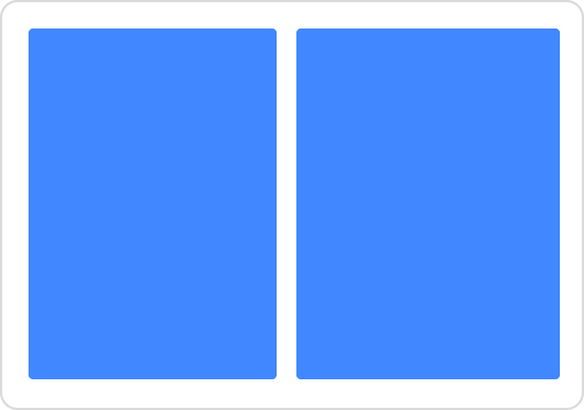
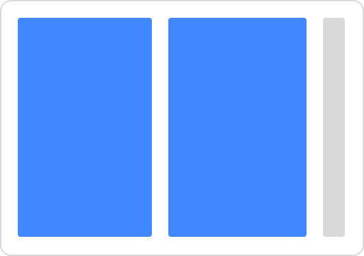
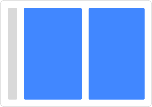
Panel States
To optimize spatial utility, I created a set of responsive panels that scale based on user needs, retaining essential icons for sources and notes even at minimal widths.
Scalability was a core principle. While the content within these panels can shift and evolve, the underlying system is built to support growth, accommodating new tools, modes, and workflows without breaking the structure.

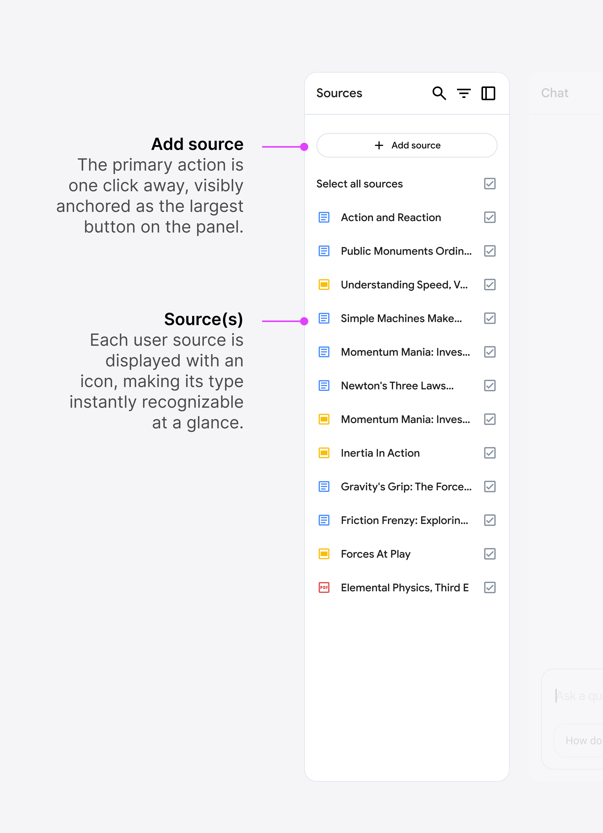
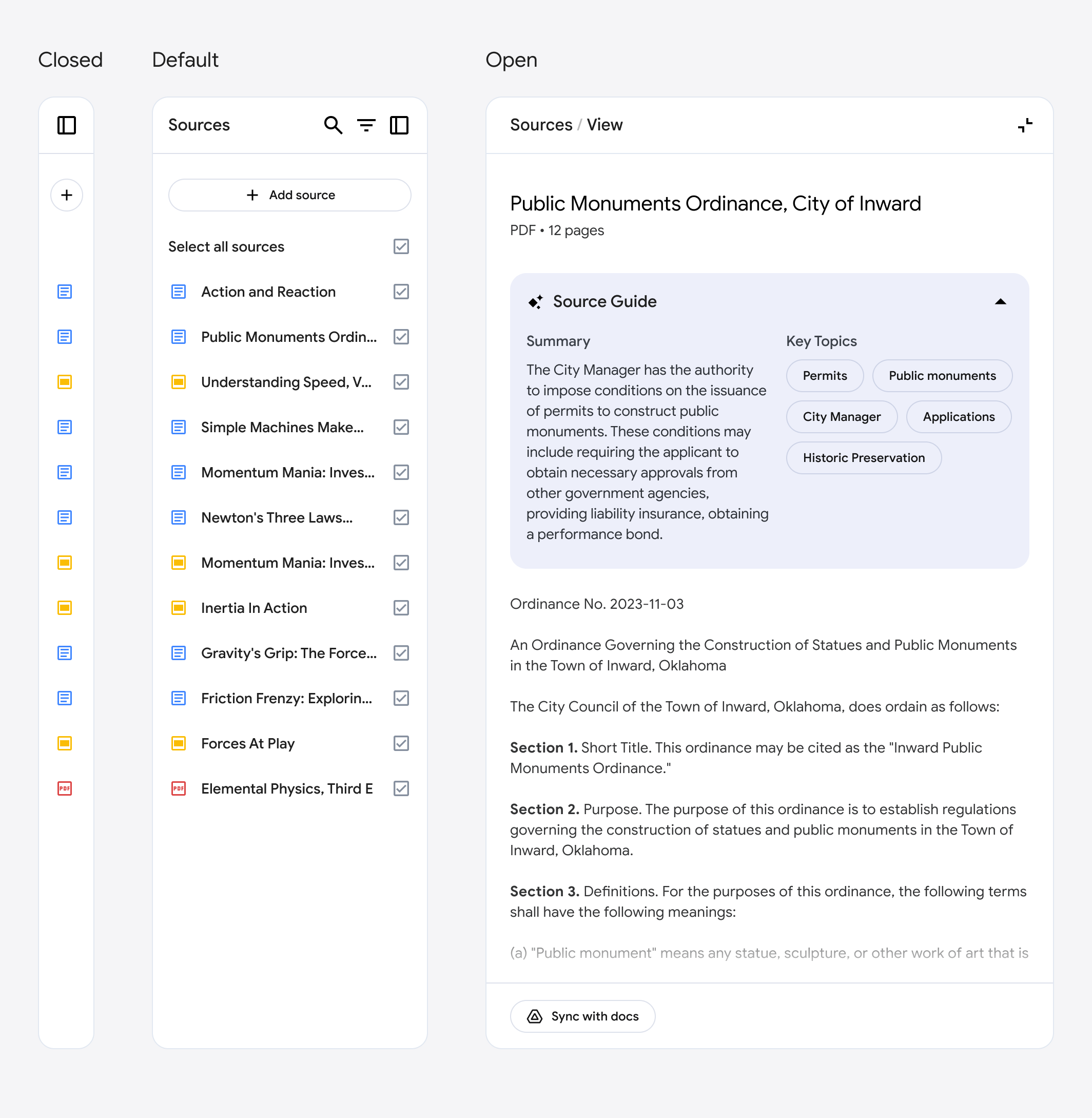
Source Panel
This is where all user-provided sources or “inputs” live. It’s the starting point of the user’s journey.

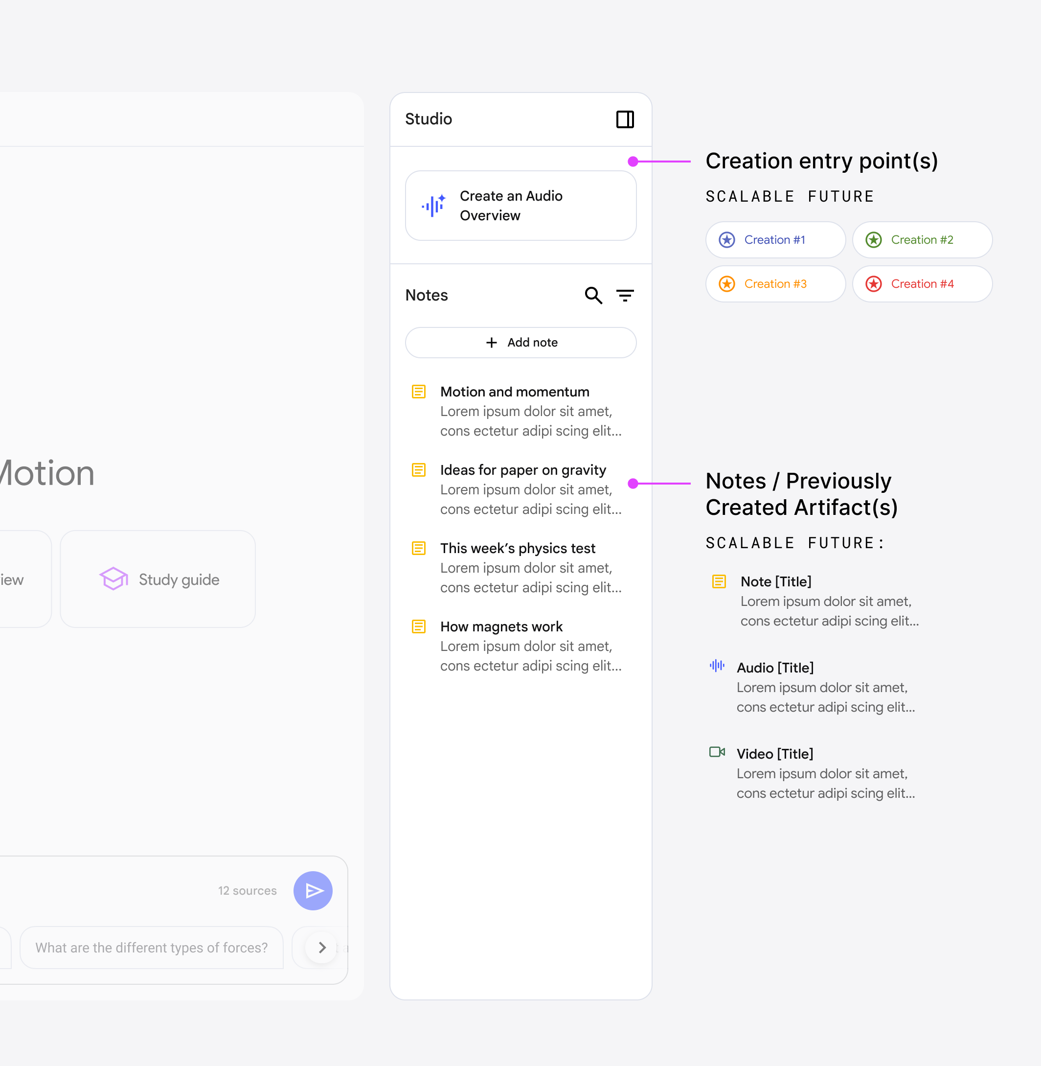
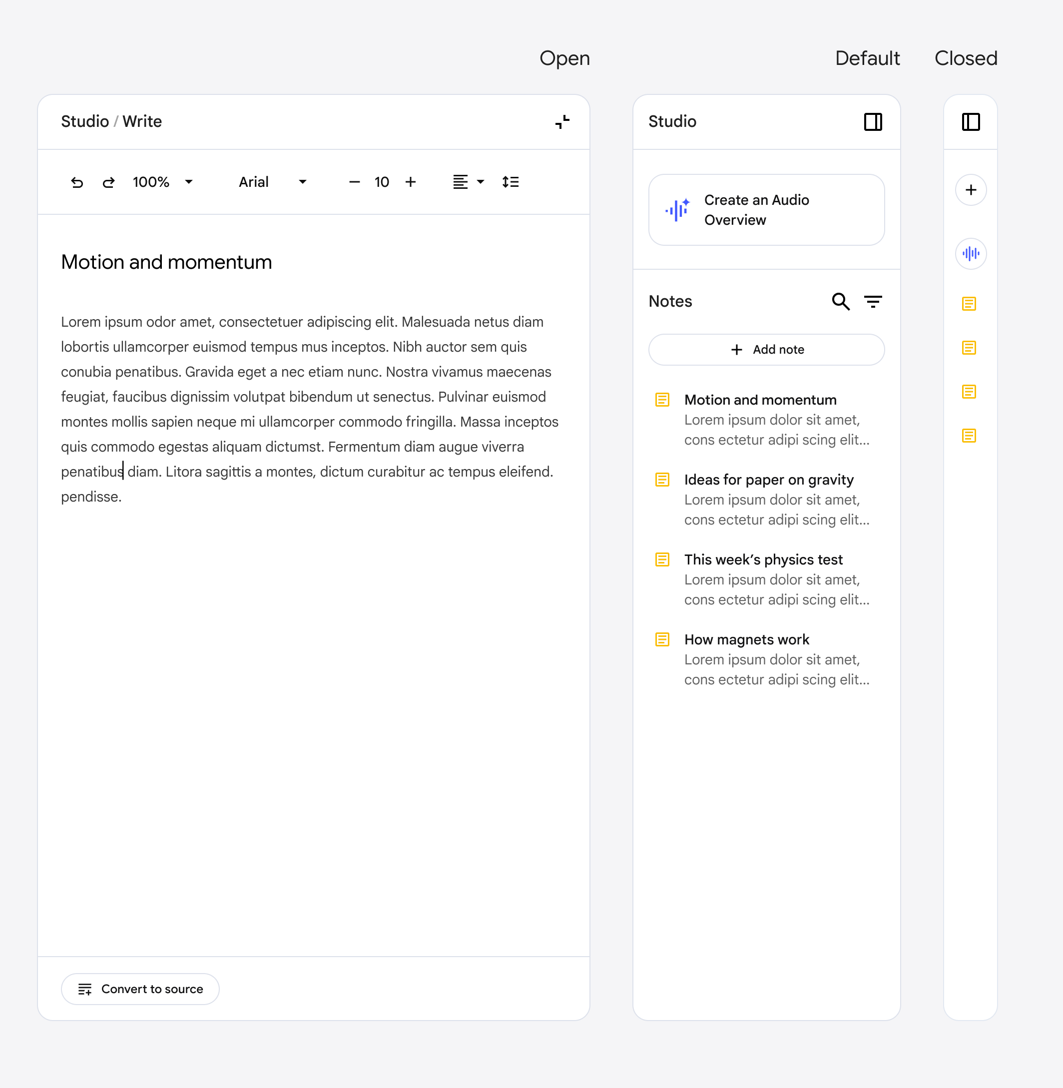
Studio Panel
Where inputs turn into outputs. This is the space for creating, shaping, and capturing work

See how the team has continued to scale this system with the newest launch of flashcards, quizzes, professional reports.

Chat Panel
The chat panel stays
at the core of the experience, dynamically adjusting its size to accommodate other tools as needed.

Here’s what that looks like:
Panels dynamically adjust based on the user’s focus and current task.
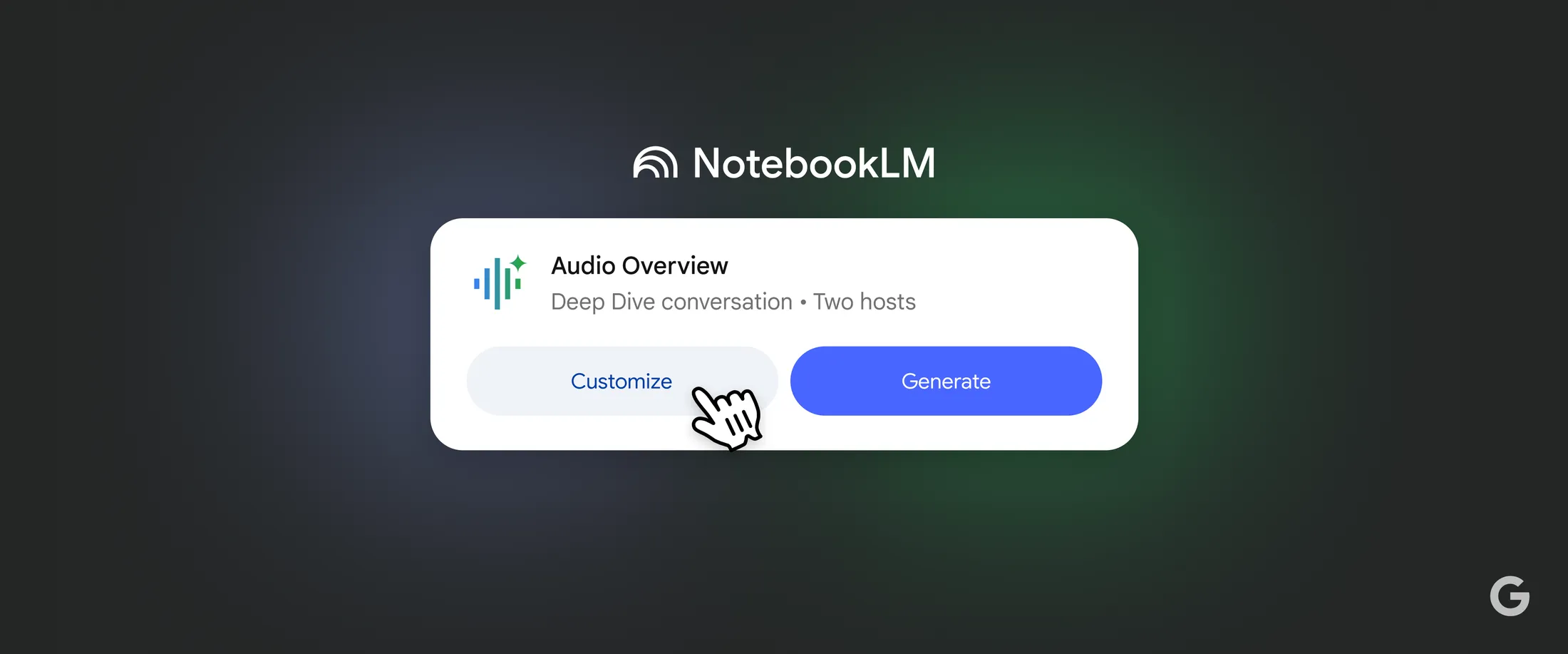
Audio Overviews
I led design on Audio Overviews, shaping the experience from prototype to launch and introducing new paradigms such as “interrupt.” I worked closely with the team to craft the end-to-end experience — and fun fact: I unintentionally coined the name Audio Overview.
Shout out to a few of the amazing x-fn team: Stephen Hughes, Oliver King, Biao (Frank) Wang, Corbin Cunningham, PhD, Yi Yao, Usama Bin Shafqat, Simon Tokumine, Michael Chen (+ more)

Read the full story

Brand Identity
Defining the brand identity was a fast-paced effort, made possible by close collaboration with Google Labs and the central brand team. Shoutout Feel Hwang, Nick Mcginnis, Jennifer Leartanasan and team.


Visual Assets
From press kits to launch visuals, I crafted the full suite of assets. Here are some of my favorites.

Key Takeaways from the Journey
- Building Audio Overviews

Jason Spielman
Linkedin →
We built and launched a viral AI product in 2 months (at Google!). Here's how:Our little NotebookLM team has had a crazy few months and is proving that small, nimble teams not only exist within Google, but can move fast and have significant impact.Our newest feature “Audio Overviews” has taken over the internet the past few days. The team has been sprinting - we went from idea to prototype in weeks, then launched publicly in under 2 months. It’s not perfect (yet!), but that’s the point. Here are a few takeaways: 1. It's about building products *with* our users, not just *for* them. We’re not waiting to launch, we’re shipping early and iterating. Tech is evolving faster than users can possibly know what they want. We're often anticipating needs for V1 then working alongside them to improve. Example: Very quickly we saw a massive user desire for in-line citations so our team quickly pivoted to build and launch. (Join our discord!)2. Built-in not bolted-on: We’re building net-new, AI native products. This isn’t just AI for the sake of “AI”, we’re working to bridge the gap between state-of-the-art research and human problems. Audio Overviews are great because they sound amazingly real, yes -- but useful because they are (1) source grounded and (2) an easy one-click way to study and digest your own information. 3. Meetings are spent *building*, not just talking about building. We’re collaborating, deeply. I am the only UX designer on the team so we have to make every moment count. Raiza and I are constantly strategizing and iterating together. NotebookLM represents a new era of product development within Labs at Google. We're putting user feedback and community engagement at the heart of everything we do. We’re building quickly and have a lot more coming soon...The audio below is made with the NotebookLM Audio Overview feature simply by feeding it the text above^! If you haven’t tried it, I highly recommend it. We want to make it better for you! Try it: notebooklm.googleShout out to a few of the amazing people on the team who've been hustling to make this all happen: Stephen Hughes, Oliver King, Biao (Frank) Wang, Corbin Cunningham, PhD, Yi Yao, Usama Bin Shafqat, Simon Tokumine (+ more)See post by Andrej Karpathy: https://lnkd.in/ghTdbyXN
- Here’s what I learned designing a novel, AI-first experience:
Jason Spielman
Linkedin →
UIs will become more dynamic: AI has unlocked unprecedented possibilities within a single tool. With NotebookLM, we aimed to create a seamless experience that supports the entire user journey: Reading → Chat → Creation. Designing for this complexity requires rethinking traditional UI paradigms. The result? A dynamic, adaptive interface that intuitively adjusts to your needs, ensuring fluidity and focus throughout your workflow.UIs will become more contextually aware: As AI expands possibilities, the challenge is managing them without overwhelming users. Context-aware interfaces help by proactively suggesting actions to reduce cognitive load. In NotebookLM’s case, some users may come to create an audio overview, while others come to chat with their sources. Anticipating these needs and surfacing the right tools/actions at the right moment streamlines workflows and minimizes friction.We are in a transition period:Right now, Chat remains the most intuitive and digestible way for users to engage with AI, acting as a familiar anchor that bridges the gap between traditional interfaces and the emerging possibilities of AI-first design. The adaptive UX ensures users can safely rely on chat when they need, while exploring new experiences like the new Audio Overview Interactive Mode.
Home
Next
🏆 New! NotebookLM Wins 2026 Webby for “Best AI User Experience” →
Design Lead
UX + Identity
2024
NotebookLM
I led design for NotebookLM, shaping the product’s core user experience, brand identity, and visual system from experiment to launch.
This remains one of my proudest projects, and I’m incredibly grateful for the opportunity to design something entirely new from the ground up. It was a chance to explore fresh paradigms, invent new patterns, and bring a product to life that hadn’t existed before. None of it would’ve been possible without the tight-knit, cross-functional team I was fortunate to collaborate with.
Podcast • Sequoia
Raiza and I discuss the journey building NotebookLM.
NotebookLM • Winner!
Recognized as one of TIME’s Best Inventions of 2024.
|
Architecture
|
3 Panel
|
Brand Identity
|
Visual Assets
|
Takeaways
Architecture
UI Evolution
Early Prototype
This is what the UI looked like before I first joined the early project.
Notes driven UI
Exploratory chat UI introduced as an overlay on the note canvas.
3-Panel Structure
Synthesizes learnings into a scalable and adaptive layout.
Problem + Requirements
One of the core problems we set out to solve with NotebookLM was “tab overwhelm” the scattered, fractured experience of jumping between tools while trying to synthesize ideas. We wanted to create a space where every part of the creation journey could happen in one place.
→ Inputs
- Source list, Open Source (wide)
Outputs →
- Notes list, Open Note (wide)
Chat
• Citations
Creation
• Multiple entry points
This visual shows how the core building blocks came together.
Early Sketches
The structure you see now may seem obvious but it took After what felt like 1000 iterations to get there. Trying to put these blocks together in a way that allowed for a clear mental model and digstible UI. These early sketches are from a plane. I ran out of paper and ultimately found the final solution when drawing on a napkin.
Mental Model
The mental model of NotebookLM was built around the creation journey: starting with inputs, moving through conversation, and ending with outputs. Users bring in their sources (documents, notes, references), then interact with them through chat by asking questions, clarifying, and synthesizing before transforming those insights into structured outputs like notes, study guides, and Audio Overviews.
By grounding the design in this linear but flexible flow (Inputs → Chat → Outputs) we gave users a clear sense of place within the product while keeping the complexity of new AI interactions digestible and intuitive.
Solution • 3 Panel Structure
It’s rare to find a product that brings reading, writing, and creation together in a truly integrated way largely because juggling all three can be overwhelming. But with AI reducing friction, the opportunity emerged to design a space where every part of the creative process could coexist.
To make that possible, I designed a responsive panel system that adapts to the user’s needs, scaling fluidly while preserving quick access to key elements like sources and notes, even at the smallest sizes.
Standard
The default layout, offering a balanced view of sources, chat, and notes.
Reading + Chat
Optimized for referencing sources and generating responses with citations.
Panel States
To optimize spatial utility, I created a set of responsive panels that scale based on user needs, retaining essential icons for sources and notes even at minimal widths.
Scalability was a core principle. While the content within these panels can shift and evolve, the underlying system is built to support growth, accommodating new tools, modes, and workflows without breaking the structure.
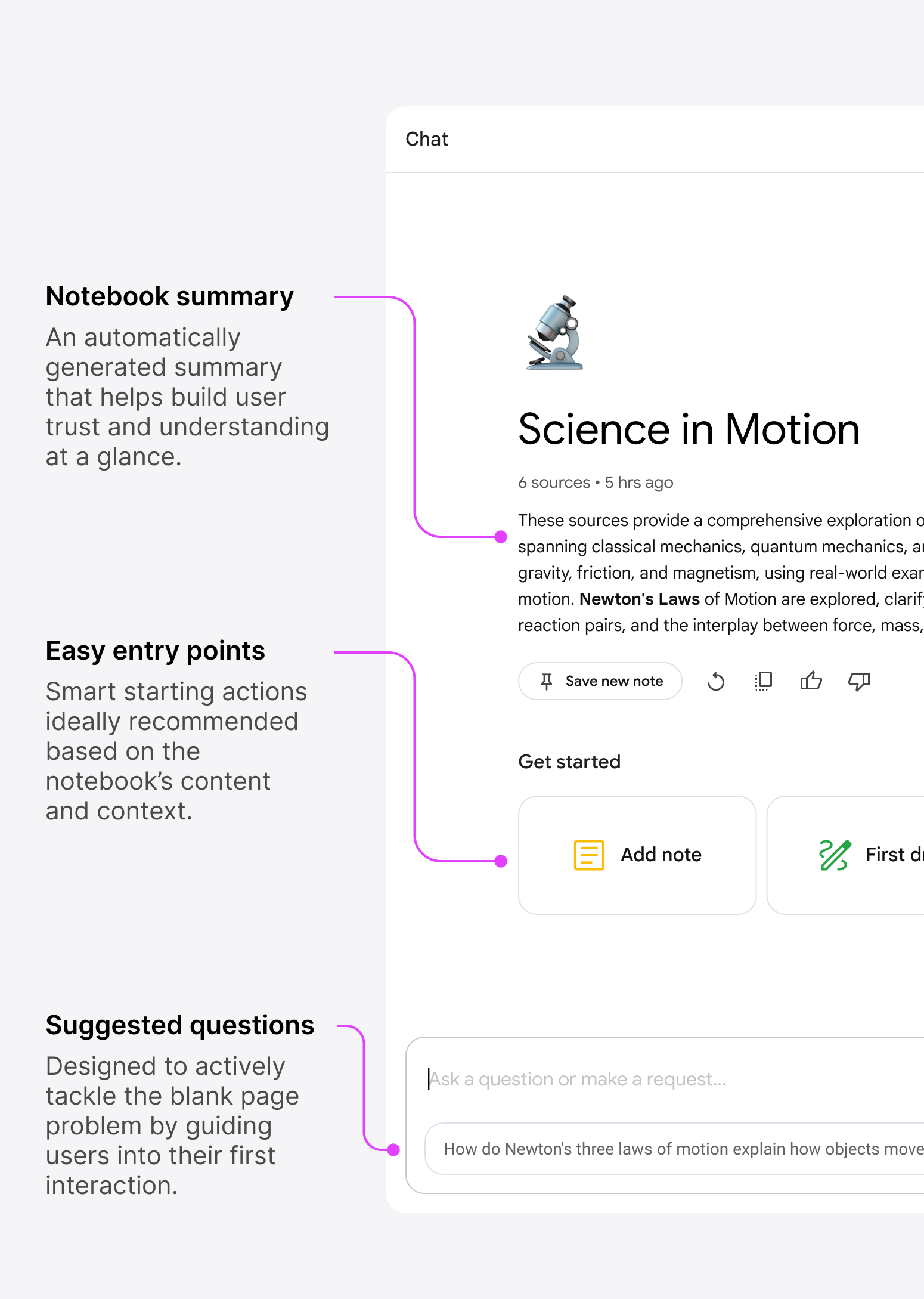
Source Panel
This is where all user-provided sources or “inputs” live. It’s the starting point of the user’s journey.
Studio Panel
Where inputs turn into outputs. This is the space for creating, shaping, and capturing work
See how the team has continued to scale this system with the newest launch of flashcards, quizzes, professional reports.
Chat Panel
The chat panel stays
at the core of the experience, dynamically adjusting its size to accommodate other tools as needed.

Here’s what that looks like:
Panels dynamically adjust based on the user’s focus and current task.
Audio Overviews
I led design on Audio Overviews, shaping the experience from prototype to launch and introducing new paradigms such as “interrupt.” I worked closely with the team to craft the end-to-end experience — and fun fact: I unintentionally coined the name Audio Overview.
Shout out to a few of the amazing x-fn team: Stephen Hughes, Oliver King, Biao (Frank) Wang, Corbin Cunningham, PhD, Yi Yao, Usama Bin Shafqat, Simon Tokumine, Michael Chen (+ more)
Read the full story
Brand Identity
Defining the brand identity was a fast-paced effort, made possible by close collaboration with Google Labs and the central brand team. Shoutout Feel Hwang, Nick Mcginnis, Jennifer Leartanasan and team.
Visual Assets
From press kits to launch visuals, I crafted the full suite of assets. Here are some of my favorites.

Key Takeaways from the Journey
- Building Audio Overviews
Jason Spielman
Linkedin →
We built and launched a viral AI product in 2 months (at Google!). Here's how:Our little NotebookLM team has had a crazy few months and is proving that small, nimble teams not only exist within Google, but can move fast and have significant impact.Our newest feature “Audio Overviews” has taken over the internet the past few days. The team has been sprinting - we went from idea to prototype in weeks, then launched publicly in under 2 months. It’s not perfect (yet!), but that’s the point. Here are a few takeaways: 1. It's about building products *with* our users, not just *for* them. We’re not waiting to launch, we’re shipping early and iterating. Tech is evolving faster than users can possibly know what they want. We're often anticipating needs for V1 then working alongside them to improve. Example: Very quickly we saw a massive user desire for in-line citations so our team quickly pivoted to build and launch. (Join our discord!)2. Built-in not bolted-on: We’re building net-new, AI native products. This isn’t just AI for the sake of “AI”, we’re working to bridge the gap between state-of-the-art research and human problems. Audio Overviews are great because they sound amazingly real, yes -- but useful because they are (1) source grounded and (2) an easy one-click way to study and digest your own information. 3. Meetings are spent *building*, not just talking about building. We’re collaborating, deeply. I am the only UX designer on the team so we have to make every moment count. Raiza and I are constantly strategizing and iterating together. NotebookLM represents a new era of product development within Labs at Google. We're putting user feedback and community engagement at the heart of everything we do. We’re building quickly and have a lot more coming soon...The audio below is made with the NotebookLM Audio Overview feature simply by feeding it the text above^! If you haven’t tried it, I highly recommend it. We want to make it better for you! Try it: notebooklm.googleShout out to a few of the amazing people on the team who've been hustling to make this all happen: Stephen Hughes, Oliver King, Biao (Frank) Wang, Corbin Cunningham, PhD, Yi Yao, Usama Bin Shafqat, Simon Tokumine (+ more)See post by Andrej Karpathy: https://lnkd.in/ghTdbyXN
- Here’s what I learned designing a novel, AI-first experience:
Wanda Wingleton
Linkedin →
UIs will become more dynamic: AI has unlocked unprecedented possibilities within a single tool. With NotebookLM, we aimed to create a seamless experience that supports the entire user journey: Reading → Chat → Creation. Designing for this complexity requires rethinking traditional UI paradigms. The result? A dynamic, adaptive interface that intuitively adjusts to your needs, ensuring fluidity and focus throughout your workflow.UIs will become more contextually aware: As AI expands possibilities, the challenge is managing them without overwhelming users. Context-aware interfaces help by proactively suggesting actions to reduce cognitive load. In NotebookLM’s case, some users may come to create an audio overview, while others come to chat with their sources. Anticipating these needs and surfacing the right tools/actions at the right moment streamlines workflows and minimizes friction.We are in a transition period:Right now, Chat remains the most intuitive and digestible way for users to engage with AI, acting as a familiar anchor that bridges the gap between traditional interfaces and the emerging possibilities of AI-first design. The adaptive UX ensures users can safely rely on chat when they need, while exploring new experiences like the new Audio Overview Interactive Mode.
Home
Next
Jason Spielman

🏆 New! NotebookLM Wins 2026 Webby for “Best AI User Experience” →
Design Lead
UX + Identity
2024
NotebookLM
I led design for NotebookLM, shaping the product’s core user experience, brand identity, and visual system from experiment to launch.
This remains one of my proudest projects, and I’m incredibly grateful for the opportunity to design something entirely new from the ground up. It was a chance to explore fresh paradigms, invent new patterns, and bring a product to life that hadn’t existed before. None of it would’ve been possible without the tight-knit, cross-functional team I was fortunate to collaborate with.
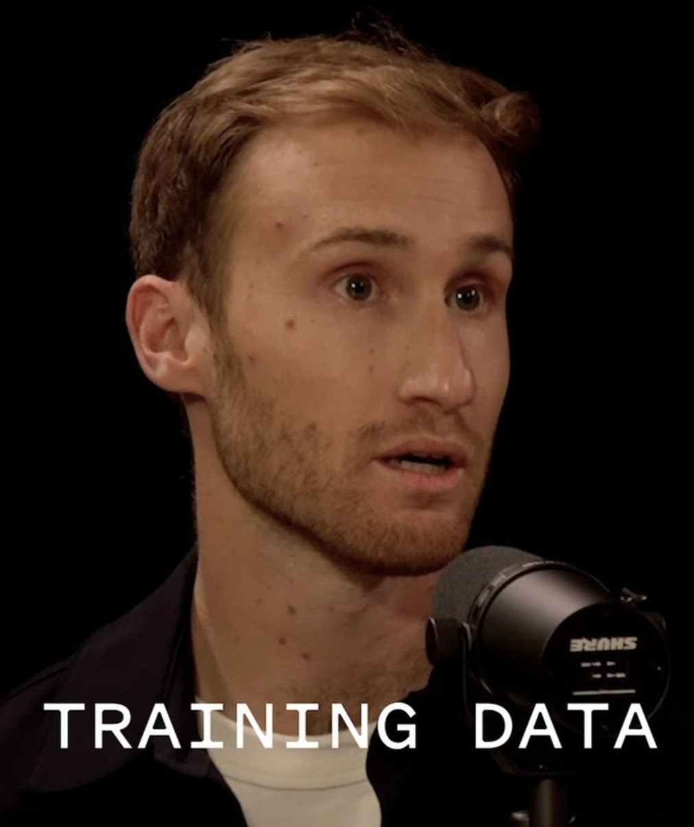
Podcast • Seqouia Training Data
Raiza and I discuss the journey building NotebookLM.
NotebookLM • Winner!
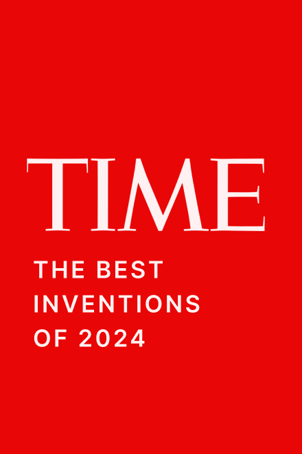
Recognized as one of TIME’s Best Inventions of 2024.
|
Architecture
|
3 Panel
|
Brand Identity
|
Visual Assets
|
Takeaways
Architecture
Design Evolution
Early Prototype
This is what the UI looked like before I first joined the early project.
Notes driven UI
Exploratory chat UI introduced as an overlay on the note canvas.
3-Panel Structure
Synthesizes learnings into a scalable and adaptive layout.
Problem + Requirements
One of the core problems we set out to solve with NotebookLM was “tab overwhelm” the scattered, fractured experience of jumping between tools while trying to synthesize ideas. We wanted to create a space where every part of the creation journey could happen in one place.
→ Inputs
- Source list, Open Source (wide)
Outputs →
- Notes list, Open Note (wide)
Chat
• Citations
Creation
• Multiple entry points
This visual shows how the core building blocks came together.
Early Sketches
The structure you see now may look obvious but it took what felt like a thousand iterations to get there. I was trying to arrange these blocks in a way that supported a clear mental model and a UI that felt intuitive and digestible.
These sketches were done on a plane. I ran out of paper and ended up sketching the final solution across a few napkins.
Mental Model
The mental model of NotebookLM was built around the creation journey: starting with inputs, moving through conversation, and ending with outputs. Users bring in their sources (documents, notes, references), then interact with them through chat by asking questions, clarifying, and synthesizing before transforming those insights into structured outputs like notes, study guides, and Audio Overviews.
By grounding the design in this linear but flexible flow (Inputs → Chat → Outputs) we gave users a clear sense of place within the product while keeping the complexity of new AI interactions digestible and intuitive.
Solution • 3 Panel Structure
It’s rare to find a product that brings reading, writing, and creation together in a truly integrated way largely because juggling all three can be overwhelming. But with AI reducing friction, the opportunity emerged to design a space where every part of the creative process could coexist.
To make that possible, I designed a responsive panel system that adapts to the user’s needs, scaling fluidly while preserving quick access to key elements like sources and notes, even at the smallest sizes.
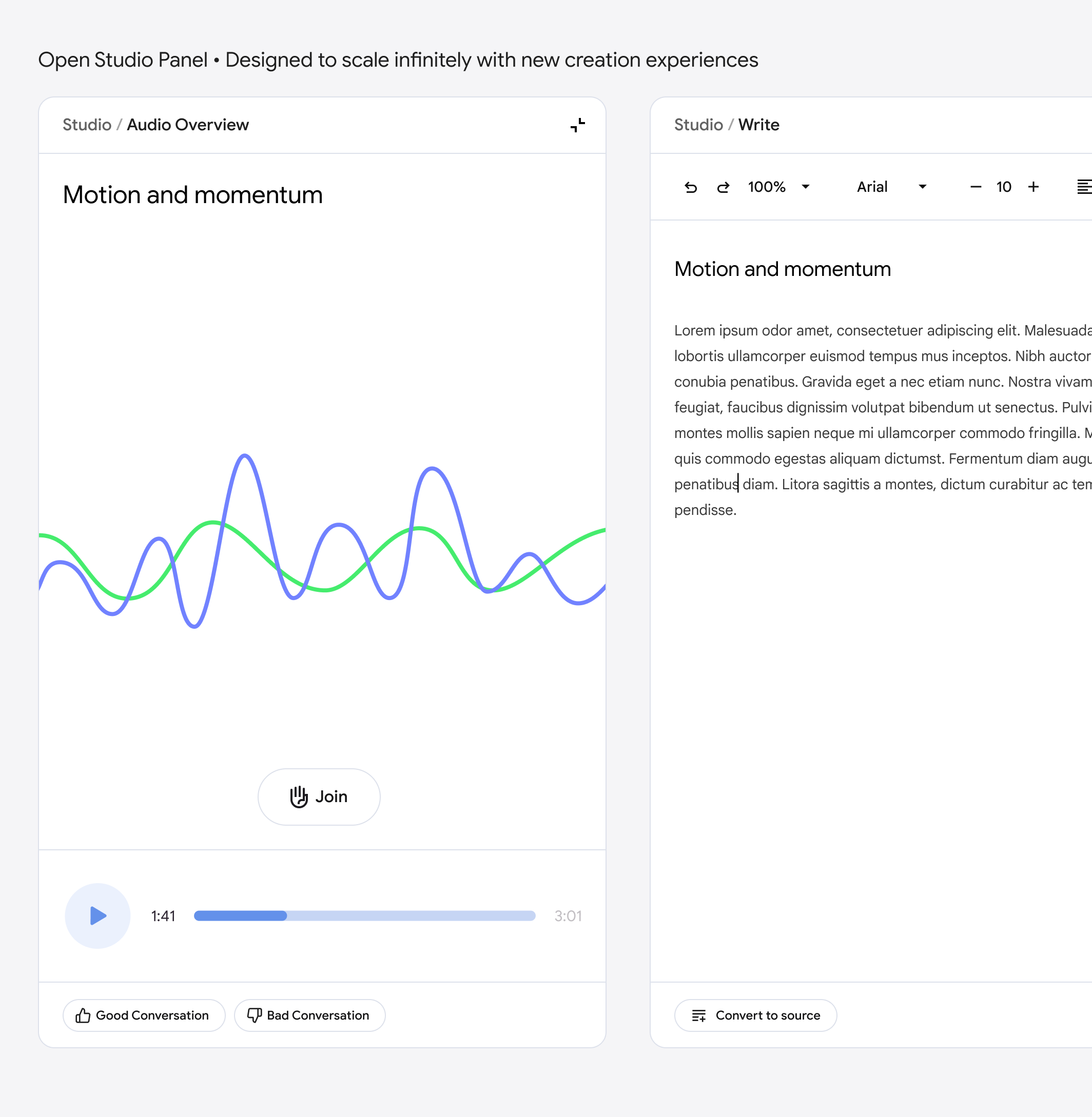
Standard
The default layout, offering a balanced view of sources, chat, and notes.
Reading + Chat
Optimized for referencing sources and generating responses with citations.
Chat + Writing
A popular request, designed for users focused on drafting and iteration.
Reading + Writing
Ideal for composing while keeping source material in view.
Panel States
To optimize spatial utility, I created a set of responsive panels that scale based on user needs, retaining essential icons for sources and notes even at minimal widths.
Scalability was a core principle. While the content within these panels can shift and evolve, the underlying system is built to support growth, accommodating new tools, modes, and workflows without breaking the structure.
Source Panel
This is where all user-provided sources or “inputs” live. It’s the starting point of the user’s journey.
Studio Panel
Where inputs turn into outputs. This is the space for creating, shaping, and capturing work
See how the team has continued to scale this system with the newest launch of flashcards, quizzes, professional reports.
Chat Panel
The chat panel stays
at the core of the experience, dynamically adjusting its size to accommodate other tools as needed.
Here’s what that looks like:
Panels dynamically adjust based on the user’s focus and current task.
Audio Overviews
I led design on Audio Overviews, shaping the experience from prototype to launch and introducing new paradigms such as “interrupt.” I worked closely with the team to craft the end-to-end experience — and fun fact: I unintentionally coined the name Audio Overview.
Shout out to a few of the amazing x-fn team: Stephen Hughes, Oliver King, Biao (Frank) Wang, Corbin Cunningham, PhD, Yi Yao, Usama Bin Shafqat, Simon Tokumine, Michael Chen (+ more)

Read the full story
Brand Identity
Defining the brand identity was a fast-paced effort, made possible by close collaboration with Google Labs and the central brand team. Shoutout Feel Hwang, Nick Mcginnis, Jennifer Leartanasan and team.
Visual Assets
From press kits to launch visuals, I crafted the full suite of assets. Here are some of my favorites.

Key Takeaways from the Journey
- Building Audio Overviews
Jason Spielman
Linkedin →
We built and launched a viral AI product in 2 months (at Google!). Here's how:Our little NotebookLM team has had a crazy few months and is proving that small, nimble teams not only exist within Google, but can move fast and have significant impact.Our newest feature “Audio Overviews” has taken over the internet the past few days. The team has been sprinting - we went from idea to prototype in weeks, then launched publicly in under 2 months. It’s not perfect (yet!), but that’s the point. Here are a few takeaways: 1. It's about building products *with* our users, not just *for* them. We’re not waiting to launch, we’re shipping early and iterating. Tech is evolving faster than users can possibly know what they want. We're often anticipating needs for V1 then working alongside them to improve. Example: Very quickly we saw a massive user desire for in-line citations so our team quickly pivoted to build and launch. (Join our discord!)2. Built-in not bolted-on: We’re building net-new, AI native products. This isn’t just AI for the sake of “AI”, we’re working to bridge the gap between state-of-the-art research and human problems. Audio Overviews are great because they sound amazingly real, yes -- but useful because they are (1) source grounded and (2) an easy one-click way to study and digest your own information. 3. Meetings are spent *building*, not just talking about building. We’re collaborating, deeply. I am the only UX designer on the team so we have to make every moment count. Raiza and I are constantly strategizing and iterating together. NotebookLM represents a new era of product development within Labs at Google. We're putting user feedback and community engagement at the heart of everything we do. We’re building quickly and have a lot more coming soon...The audio below is made with the NotebookLM Audio Overview feature simply by feeding it the text above^! If you haven’t tried it, I highly recommend it. We want to make it better for you! Try it: notebooklm.googleShout out to a few of the amazing people on the team who've been hustling to make this all happen: Stephen Hughes, Oliver King, Biao (Frank) Wang, Corbin Cunningham, PhD, Yi Yao, Usama Bin Shafqat, Simon Tokumine (+ more)See post by Andrej Karpathy: https://lnkd.in/ghTdbyXN
- Here’s what I learned designing a novel, AI-first experience:
Jason Spielman
Linkedin →