
Home
Next

Identity + Brand Design
2025
Ovation Development
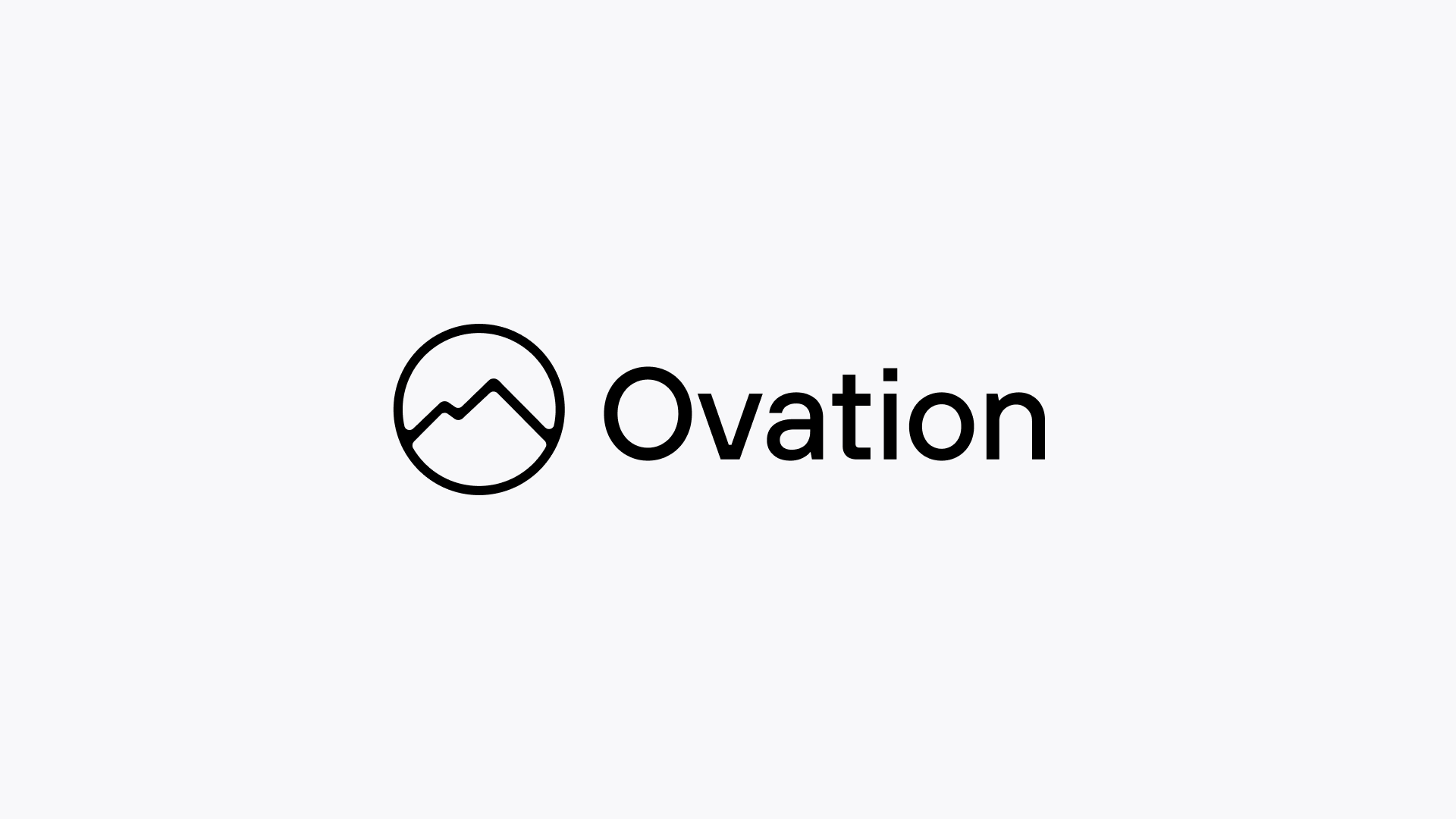
I was brought on to lead the rebrand of Ovation Development a respected, long-standing real estate and development firm based in Las Vegas. Known for their thoughtful residential communities and ambitious commercial projects, Ovation has played a key role in shaping the region’s skyline and neighborhoods.
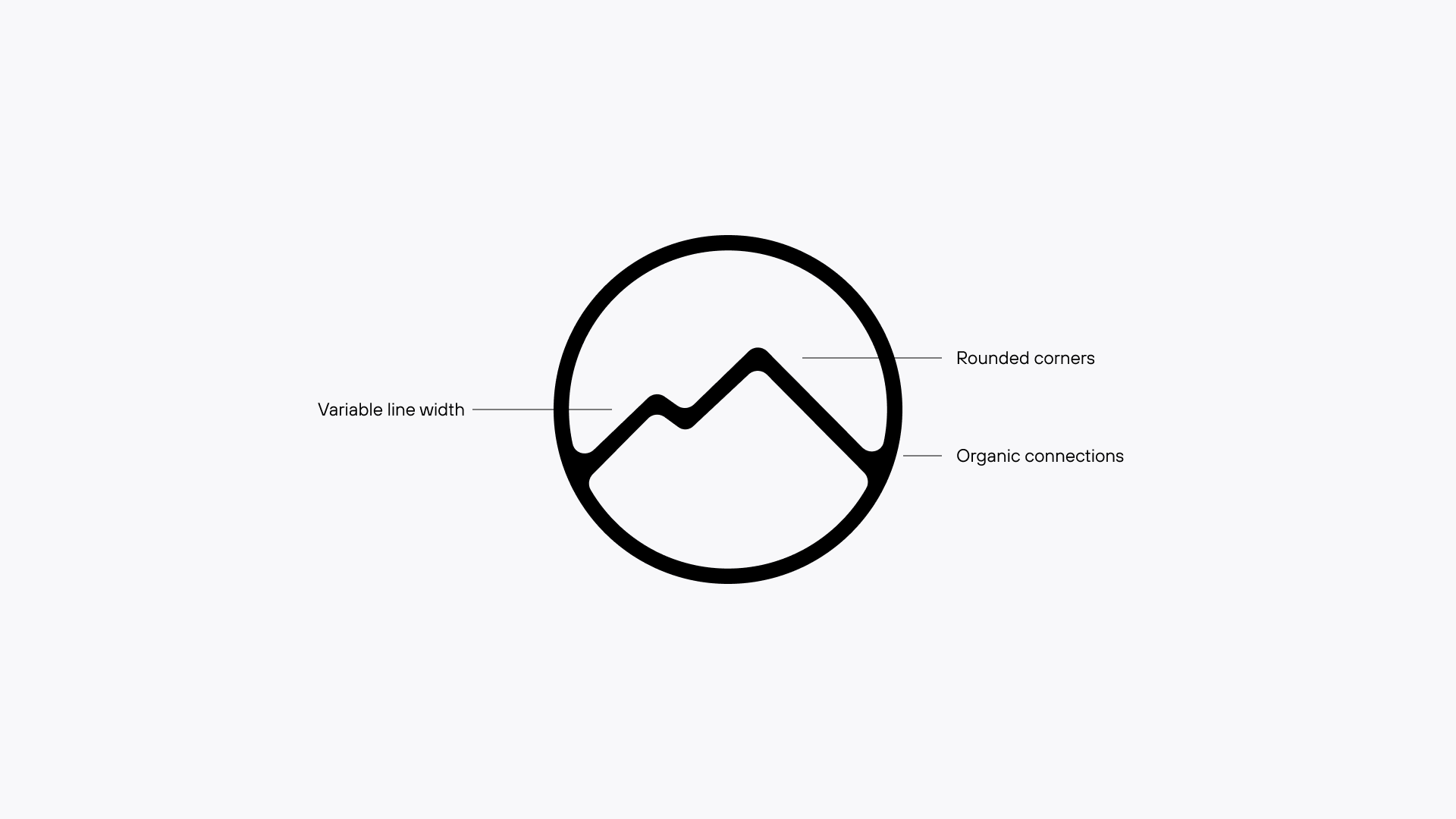
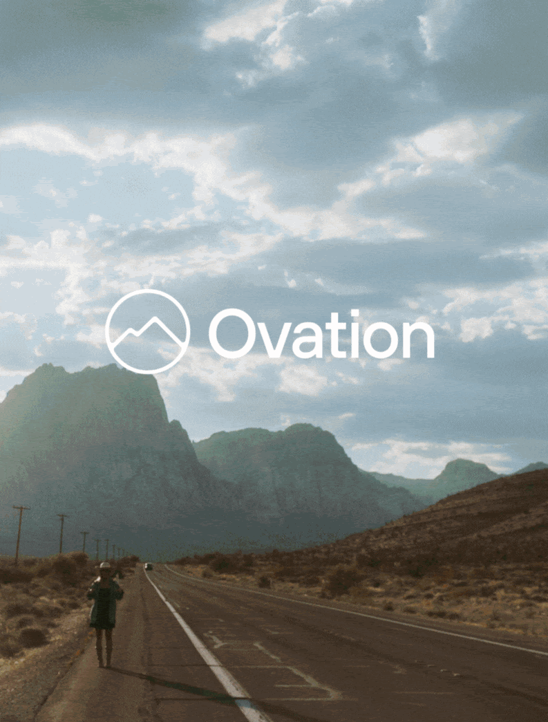
The creative challenge was balancing the dual nature of their brand: crafting a friendly, modern identity that resonates with homebuyers, while also conveying the strength, grit, and boldness behind their large-scale development work. I also wanted the new identity to reflect their deep roots and long-term commitment to the region, capturing the essence of Las Vegas through the warm tones and enduring presence of the surrounding Red Rocks.
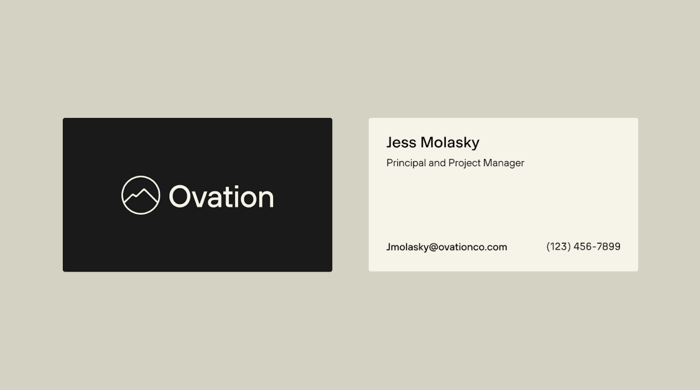
Brand Identity

Home
Next
Identity + Brand Design
2025
Ovation Development
I was brought on to lead the rebrand of Ovation Development a respected, long-standing real estate and development firm based in Las Vegas. Known for their thoughtful residential communities and ambitious commercial projects, Ovation has played a key role in shaping the region’s skyline and neighborhoods.
The creative challenge was balancing the dual nature of their brand: crafting a friendly, modern identity that resonates with homebuyers, while also conveying the strength, grit, and boldness behind their large-scale development work. I also wanted the new identity to reflect their deep roots and long-term commitment to the region, capturing the essence of Las Vegas through the warm tones and enduring presence of the surrounding Red Rocks.
Brand Identity